Your product is amazing, but the label looks cheap and peels off. This hurts your brand's image and sales. This guide shows you how to design beautiful, functional labels.
Designing the perfect cosmetic label[^1] involves balancing aesthetics, regulatory requirements[^2], and practical production needs. It must attract customers while clearly listing ingredients, usage instructions, and working with your chosen packaging material to ensure it performs perfectly from shelf to shower.

I've worked in this industry for years, and I've seen how a simple label can make or break a product. A great label does more than just look pretty; it works hard for your brand. It has to survive shipping, sit beautifully on a shelf, and hold up in a steamy bathroom. Getting this right from the start saves so much time and money. Let's break down everything you need to know, step-by-step.
What Information Must Be on a Cosmetic Label?
Worried your labels are not compliant? A mistake can lead to recalls and fines. I'll guide you through the essential information to keep your brand safe and legal.
A cosmetic label[^1] must legally include the product identity[^3], net quantity, a full ingredient list[^4], the manufacturer's details, and any required warnings. For US markets, this means following FDA rules[^5], while the EU has its own specific regulations you must meet.
![]()
Getting the legal stuff right is non-negotiable. I once worked with a client who missed the "country of origin" on their labels. They had to relabel an entire shipment before it could enter the country. It was a very costly and stressful lesson for them. The rules can seem complex, but they are there to protect consumers and you. You need to know exactly what to put on your label depending on where you sell your product.
Key Regulatory Information
The two biggest markets, the US and the EU, have similar but distinct rules. In the US, the FDA governs cosmetic label[^1]ing under the Fair Packaging and Labeling Act (FPLA). In the European Union, it's the EU Cosmetic Regulation[^6]. Both require clear and accurate information. For example, the ingredient list[^4] must use the International Nomenclature of Cosmetic Ingredients (INCI) names. This ensures consistency across the globe.
Comparing US and EU Requirements
Let's look at a simple breakdown.
| Requirement | USA (FDA) | European Union (EU) |
|---|---|---|
| Ingredient List | Required, in descending order of predominance. | Required, in descending order of concentration. |
| Net Quantity | Required in both metric and imperial units. | Required in metric units. |
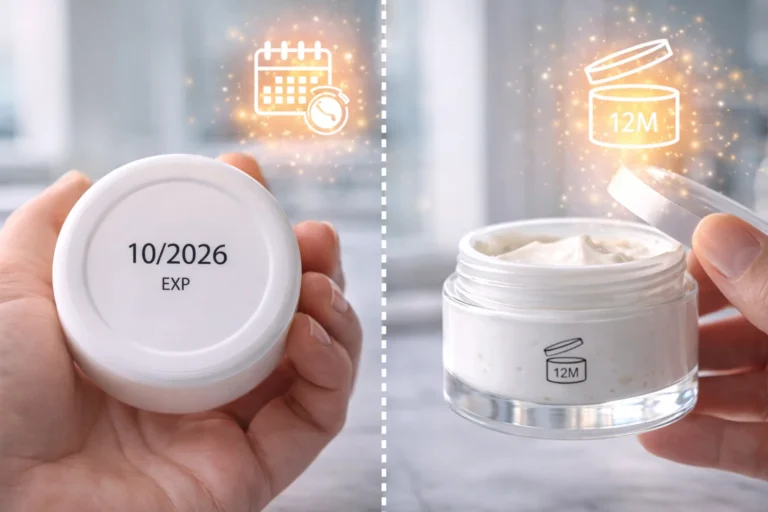
| "Best By" Date | Not always required. | Required if shelf life[^7] is less than 30 months. |
| PAO Symbol | Not required. | Required (Period After Opening symbol). |
| Responsible Person | Name and address of manufacturer or distributor. | Name and address of a "Responsible Person" based in the EU. |
Understanding these differences is key if you plan to sell internationally. It's always best to design your label to be compliant in the strictest market you sell in.
Why Does Cosmetic Label Design Matter So Much?
Is your amazing product getting overlooked on the shelf? A boring label can make it invisible. Let's explore how great design can make your product the star of the show.
Cosmetic label design is your silent salesperson. It communicates your brand's story, values, and quality in seconds. A well-designed label can attract customers, build trust, and justify a premium price point, making it a critical investment for any beauty brand's success.

Your label is often the first interaction a customer has with your brand. Think about it. When you're browsing in a store, what makes you pick up one bottle over another? It's the design. I remember a client's sales nearly tripled after we redesigned their label. We went from a cluttered, confusing look to a clean, elegant design. The formula inside was the same, but the new label communicated its quality. It made people believe in the product before they even opened it. This is the power of great design.
First Impressions and Brand Perception
Your label's design elements work together to create a feeling.
- Color Psychology: Soft pastels might suggest a gentle, soothing product, while bold, bright colors can feel energetic and youthful. Black and gold often signal luxury and premium quality.
- Typography: The font you choose says a lot. A clean, sans-serif font can feel modern and clinical, perfect for a science-backed skincare line. A flowing script font might be better for an artisanal, handcrafted brand.
- Imagery and Graphics: A simple botanical illustration can instantly communicate that your product uses natural ingredients. Abstract patterns might appeal to a more artistic, modern customer.
These choices build your brand identity and help you connect with your target audience.
Communicating Your Unique Value
Your label is also prime real estate for highlighting what makes your product special. Is it vegan, cruelty-free, organic, or made for sensitive skin? These are key selling points. Using clear icons or callouts on the front of your label can grab the attention of customers looking for those specific benefits. It builds trust and makes the purchasing decision easier for them.
How Do You Choose the Right Cosmetic Label Material?
Did your beautiful label smudge or peel in the shower? The wrong material can ruin the customer experience. Let's find a material that looks great and lasts.
Choosing the right material depends on your product and its use. Waterproof materials like BOPP are great for bath products. Clear labels offer a "no-label" look, while textured paper can feel luxurious. Consider the product's environment to make the best choice.

This is where beauty meets reality. A gorgeous design on the wrong material is a waste. I've seen labels for expensive face oils dissolve because the material wasn't oil-resistant. I've also seen shampoo bottle labels peel off after one use in the shower. These issues make a brand look cheap and unprofessional. The material you choose has to stand up to the product inside the container and the environment where the customer will use it. It's a practical decision that has a huge impact on how your brand is perceived.
Durability and Product Environment
You have to think about the life of your product.
- Waterproof: If your product will be used in the shower or stored in a humid bathroom (like shampoo, body wash, or face wash), you need a waterproof material. BOPP (Biaxially Oriented Polypropylene) is a fantastic, cost-effective option. It's a type of plastic that resists water and oil.
- Oil-Resistant: For products like face oils, serums, or oil-based cleansers, you need a label that won't degrade or let ink run when the product drips on it. A vinyl label or a BOPP label with a protective laminate is essential here.
- Squeezable: If your product is in a squeezable tube, you need a flexible material like vinyl or a conformable BOPP that can bend and stretch without peeling or wrinkling.
Aesthetics and Brand Feel
The material also contributes to the look and feel of your brand. A matte finish can look sophisticated and modern. A gloss finish makes colors pop and feels sleek. For luxury or natural brands, a textured paper label, like an estate paper, can provide a tactile, high-end experience. Just be sure to pair it with a product that won't be exposed to much water unless the paper is laminated.
How Do You Match Labels with Different Cosmetic Packaging?
Is your label wrinkling on your curved bottle? Not all labels fit all containers. Let's ensure your design works perfectly with your chosen packaging for a professional look.
Matching labels to packaging is crucial. For curved surfaces like tubes or jars, flexible materials and correct sizing are key to prevent wrinkling. For flat-sided boxes, rigid paper labels work well. Always test your label on the final container before mass production.

This is one of the most common practical mistakes I see. A brand will spend a fortune on beautiful packaging and label design, but they forget to test how the two work together. A client once came to me because their labels kept flagging, which means the edges were peeling up, on their new squeeze tubes. The adhesive wasn't strong enough and the label shape was slightly off. We had to adjust both. A simple test on a few sample tubes would have saved them thousands of dollars and a lot of stress.
Labels for Jars and Tubs
Jars are common for creams and balms. You have a few options here. A wrap-around label goes all the way around the jar. For this, you need a flexible material to hug the curve smoothly. You can also use separate front and back labels. Many brands also use a round label on the lid or the bottom of the jar. For small-diameter jars, a flexible material is even more important to prevent the edges from lifting over time.
Labels for Bottles and Tubes
Bottles and tubes, especially if they are tapered, are tricky. A standard rectangular label will wrinkle or "smile" on a tapered surface. You need a label that is cut into a slight arc to compensate for the curve. A good label supplier can help you figure out the exact die-line shape you need. Squeezable tubes also require a very durable and flexible label material, like vinyl, that won't crack or peel when the tube is squeezed repeatedly. The adhesive also needs to be strong enough to hold on tight.
What Are the Most Common Cosmetic Label Design Mistakes?
Afraid of making a costly design mistake? Simple errors can damage your brand and cost a fortune to fix. Let's look at the common pitfalls so you can avoid them.
Common mistakes include using unreadable fonts, choosing colors with low contrast, forgetting regulatory information, and designing a label that doesn't fit the container properly. Another big one is not testing the label material's durability against the product itself, like an oil-based serum.

I could write a whole book on this topic. It's painful to see a great product fail because of a simple, avoidable label mistake. One of the worst I saw was a brand that used a beautiful, light-grey font on a white background for their ingredient list[^4]. It was completely unreadable. Not only is this bad for customers, but it's also a compliance risk. These mistakes often happen when design is prioritized over function and readability. A successful label has to be a perfect marriage of both.
Readability and Visual Hierarchy
Your label must be easy to read. This is rule number one.
- Tiny Fonts: Don't make your ingredient list[^4] or instructions microscopic. There are legal minimums for font size in some regions for a reason.
- Poor Contrast: Light text on a light background or dark text on a dark background is a recipe for disaster. Ensure there is enough contrast for easy reading.
- No Hierarchy: The most important information, like the product name and its main benefit, should be the most prominent. Use size, color, and placement to guide the customer's eye.
Practical and Production Issues
These mistakes can cost you a lot of money.
- Wrong Material or Adhesive: As we've discussed, a label that peels, smudges, or wrinkles makes your product look cheap.
- Incorrect Sizing: A label that's too big or too small for the application area looks amateur. Always measure your container precisely and leave a small margin.
- Forgetting Bleed: If your design has color or images that go to the edge of the label, you must extend them slightly beyond the cut line. This is called a bleed, and it prevents ugly white edges if the cut is slightly off.
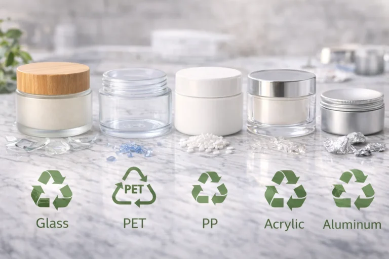
How Do Different Cosmetic Label Materials Compare?
Confused by all the label material options? Choosing between BOPP, vinyl, and paper can be overwhelming. Let's break down the pros and cons of each to simplify your decision.
BOPP is a versatile, waterproof plastic ideal for most cosmetics. Vinyl is more durable and flexible, great for squeezable tubes. Paper offers a natural, premium feel[^8] but is less durable unless laminated. The best choice depends on your budget, product, and brand.

Choosing a material feels technical, but it’s really about matching the material's properties to your product's needs. Think of it like choosing an outfit. You wouldn't wear a wool sweater to the beach. In the same way, you wouldn't put a standard paper label on a bottle of shower gel. I always advise clients to get a sample pack from their label printer. Feeling the materials and even testing them with your product can make the decision much clearer. It helps you visualize the final product and avoid any surprises.
A Detailed Material Breakdown
Let's dive into the most popular options with a comparison table. This will help you see the differences at a glance.
| Material | Best For | Durability | Look & Feel | Cost |
|---|---|---|---|---|
| White BOPP | Most products, especially those in wet environments. | High (Waterproof, Oil-Resistant) | Sleek, modern (Gloss or Matte) | $$ |
| Clear BOPP | Creating a "no-label" look on clear or colored containers. | High (Waterproof, Oil-Resistant) | Invisible, minimalist | $$ |
| Vinyl | Squeezable tubes, outdoor products. | Very High (Waterproof, UV-Resistant) | Flexible, durable | $$$ |
| Estate Paper | Luxury products, dry goods, gift boxes. | Low (unless laminated) | Textured, premium, natural | $$$ |
| Metallic BOPP | Creating a foil or metal look. | High (Waterproof, Oil-Resistant) | Shiny, luxurious, eye-catching | $$$$ |
Each of these has its place. White BOPP is the workhorse of the industry; it's reliable and looks great. Clear BOPP is fantastic for showing off the product inside the bottle. Vinyl is the tough guy, perfect for products that will be handled a lot. And estate paper is all about creating that tactile, high-end feel for a luxury cream or artisanal soap.
What Are the Cosmetic Label Design Trends for 2026?
Want your brand to look modern and fresh? Sticking to old design trends can make you look dated. Let's explore the future of cosmetic labels to keep you ahead.
In 2026, expect to see minimalist designs with bold typography, earthy color palettes inspired by nature, and interactive elements like QR codes. Textured materials and unique die-cut shapes will also be popular to create a memorable unboxing experience for customers.

Staying on top of trends is important, but it's not about blindly following them. It's about understanding what they say about our customers. Today, consumers want transparency, authenticity, and unique experiences. The design trends we're seeing are a direct reflection of that. I tell my clients to look at trends as a source of inspiration, not a set of rules. The goal is to find a trend that aligns with your brand's unique story and makes it feel current and relevant to today's shoppers.
Minimalism and Bold Type
Less is more. Clean, uncluttered layouts with a lot of white space feel honest and confident. They suggest that the product is so good, it doesn't need a flashy label to sell it. This trend is often paired with a single, bold font for the product name. This creates a strong focal point and makes the brand name memorable. It's a powerful look that communicates clarity and effectiveness.
Interactive and Smart Labels
Labels are becoming gateways to digital experiences. A simple QR code can link a customer to a video tutorial on how to use the product, a full list of ingredient sources, or even an augmented reality (AR) filter. This is a brilliant way to add value, educate your customer, and build a deeper brand connection long after the purchase is made. It makes your packaging a living part of your marketing.
Tactile Experiences
In a digital world, physical touch stands out. Brands are using textured papers, soft-touch laminates, and finishes like embossing (raised design) or debossing (impressed design) to create a label that feels special. Unique die-cut shapes that break away from the standard rectangle or circle also make a product stand out on the shelf and feel more custom and high-end.
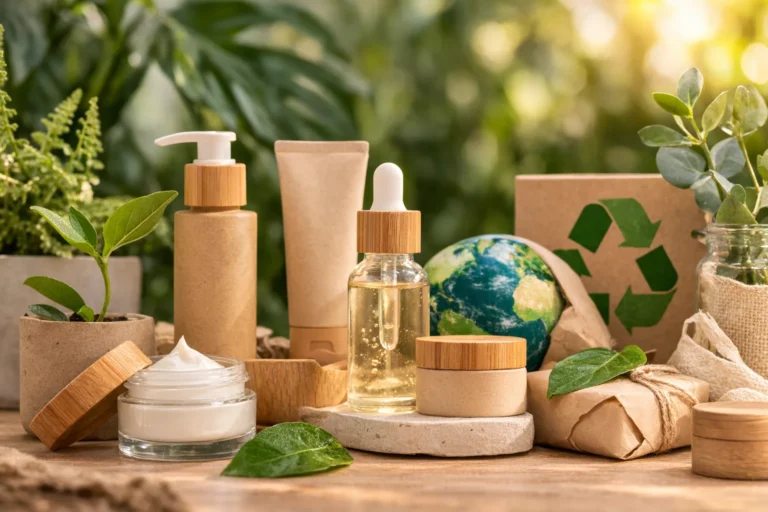
How Can You Create Sustainable Cosmetic Labels?
Do your customers value eco-friendly products? Your label is part of that promise. Using unsustainable materials can hurt your brand's credibility. Let's explore green label options.
To create sustainable labels, choose materials made from recycled content (like PCR) or renewable sources like sugarcane. Use "wash-off" adhesives that help with recycling the container. Also, consider printing with soy-based inks to reduce your environmental impact.

Sustainability isn't a trend anymore; it's a core expectation for many consumers, especially in the beauty space. Your customers read your ingredient list to see what's inside, and they are starting to look at your packaging to see if your brand's values align with theirs. I've seen brands gain a loyal following simply by being transparent about their sustainable packaging choices. It's a powerful way to build trust and show that you care about more than just profits.
Eco-Friendly Materials
The options for green materials are growing every day.
- Post-Consumer Recycled (PCR) materials: These are plastics or papers made from recycled waste. Using a 30% or 90% PCR label material reduces the need for new fossil fuels.
- FSC-Certified Paper: If you want a paper look, choose one that is certified by the Forest Stewardship Council (FSC). This ensures it comes from responsibly managed forests.
- Bio-based plastics: There are innovative materials made from renewable resources like sugarcane or corn starch (PLA). These are an alternative to traditional petroleum-based plastics.
Adhesives and Inks
The parts of the label you don't see also matter. A "wash-off" adhesive is designed to separate cleanly from a PET plastic container during the recycling process. This means more of the container can be successfully recycled. Also, ask your printer about using vegetable-based or soy-based inks instead of traditional solvent-based inks. They are less harmful to the environment. Every little choice adds up to a more sustainable product.
Conclusion
A great cosmetic label is a blend of art, science, and law. It must be beautiful, compliant, and practical to succeed. It's your brand's hardest-working marketing tool.
[^1]: Explore this resource to learn how to create effective cosmetic labels that attract customers and comply with regulations.
[^2]: Understanding these requirements is crucial for compliance and avoiding costly mistakes.
[^3]: Learn the essential elements that must be included for product identity compliance.
[^4]: Learn the best practices for listing ingredients to ensure clarity and compliance.
[^5]: This resource provides essential information on FDA regulations that every cosmetic brand must follow.
[^6]: Gain insights into EU regulations to ensure your products meet necessary standards.
[^7]: Learn how to properly indicate shelf life to comply with regulations and inform customers.
[^8]: Discover design elements that can elevate your brand's perception and appeal.