
Choosing the right packaging color can make or break a sale—it’s often the first impression your customer gets.
The most attractive colors for packaging are those that match the product's emotion and target customer—like pink, black, gold, white, and nude tones in beauty1.
Sometimes I only have seconds to catch a buyer’s eye. Colors become my silent sales assistant, working before I even say a word.
Why Are Colors Important in Cosmetics Brand Packaging?
Color tells the customer what to feel—before they even touch the product.
Colors influence how customers perceive quality, trust, and style2 in cosmetics packaging.
Colors Create Emotional Connection
In my experience, soft pink makes people feel gentle, while black feels premium. Customers react without thinking—it’s like instinct.
Color Supports Brand Identity
Luxury brands often use black and gold. Natural brands lean into green or beige. I always suggest clients keep color consistent across product lines3.
| Color | Emotion/Association | Usage Example |
|---|---|---|
| Pink | Feminine, Soft | Skincare, Lipstick |
| Black | Luxurious, Strong | High-end serums |
| Green | Natural, Fresh | Organic body care |
| Gold | Premium, Glamorous | Anti-aging products |
What Color Packaging Sells the Most?
Some colors just move off the shelf faster—especially when they fit the trend.
Neutral tones like white, beige, and pink sell well, but black and gold perform best in premium categories4.
Trend + Color = Sales
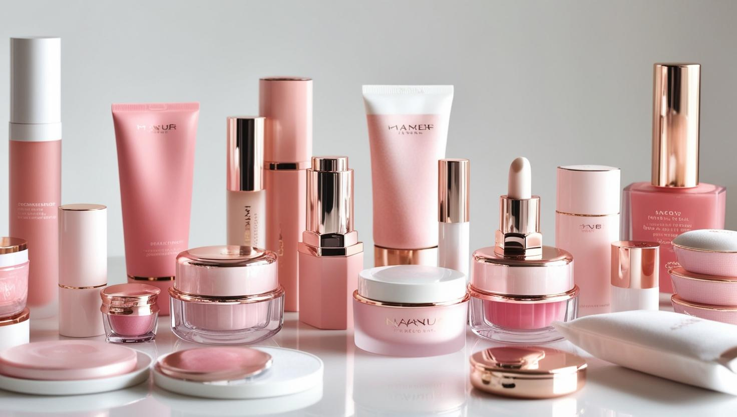
I noticed nude tones have become popular in minimalist branding. When I used beige bottles with matte finishes, my Indonesian customer saw a sales boost.
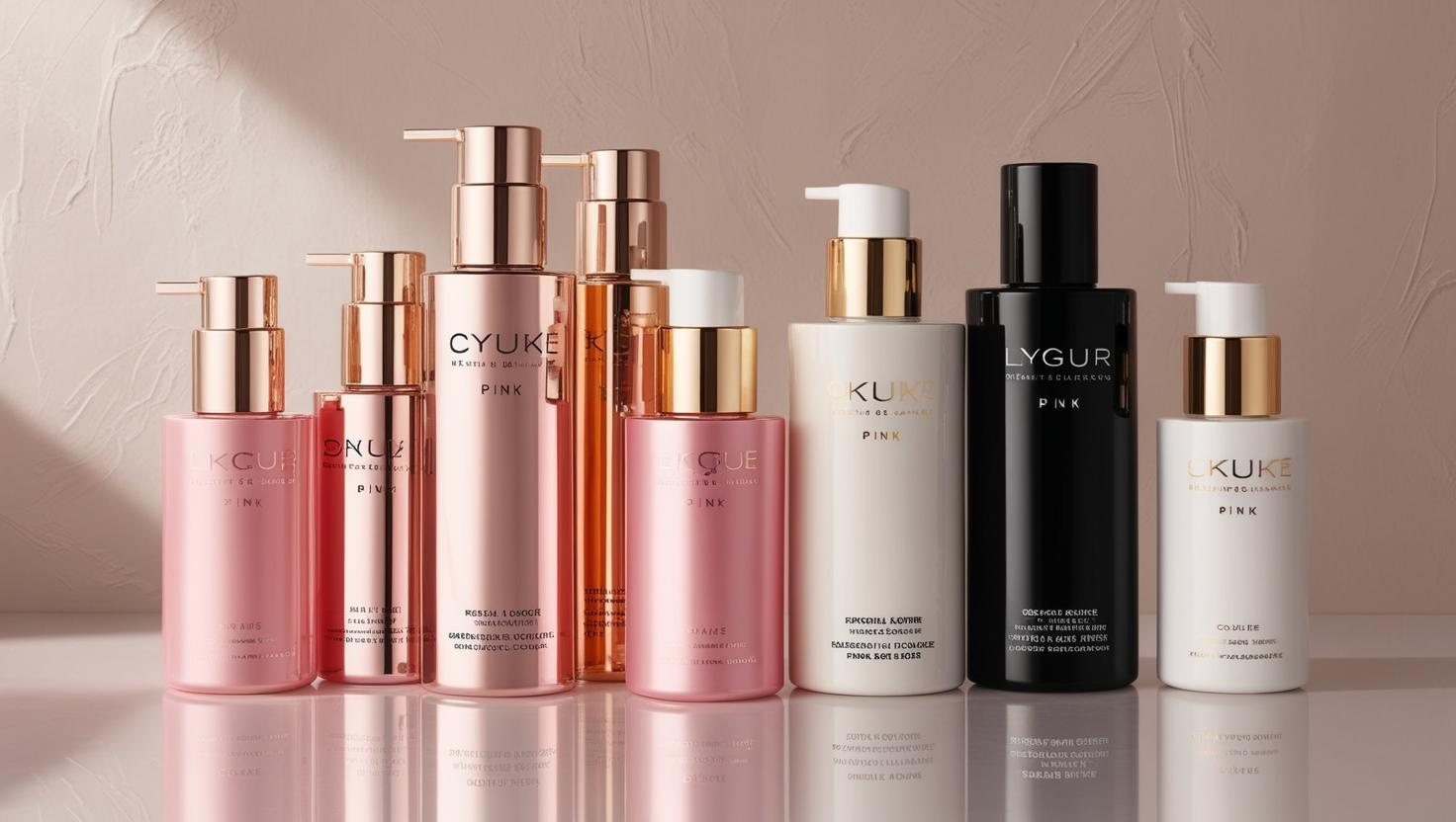
Black and Gold = Instant Luxury
For higher-end products, black packaging with gold accents signals value. Many distributors told me this combo makes their display look expensive—even if the product is affordable.
What Color Represents Cosmetics?
Cosmetics don’t have one fixed color—but a few always stand out.
Cosmetic products are often represented by pink, nude, and white, reflecting softness, beauty, and purity.
Why These Colors Work
Pink feels romantic. White feels clean. Nude tones feel modern. These colors appeal to different audiences but all suggest beauty and care.
Cultural Difference Matters
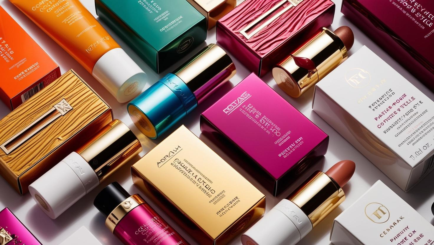
For example, some Southeast Asian customers prefer brighter colors5—like red or orange—to stand out in markets. In Europe, soft and muted tones feel more premium.
What Colors Are Good for Beauty Business?
Color isn’t just design—it’s strategy.
Good colors for the beauty business are ones that match the brand’s voice, price point, and customer expectations.
Pick Color by Market and Margin
For budget-friendly items, I recommend soft plastic in pastel tones—it feels cute and clean. For premium brands, black, frosted, or metallic finishes give more perceived value.
Try Testing in Small Batches
I usually tell new clients to test two or three colors with small MOQ orders. That way, they can see what their buyers react to before committing big.
Conclusion
Color is silent, but it speaks the loudest in beauty packaging.
-
Learn which colors are proven to attract more buyers in the cosmetics industry and why. ↩
-
Discover how color psychology affects consumer behavior in marketing. ↩
-
Understand why brand consistency in color helps build trust and recognition. ↩
-
Backed by market research, find out which packaging colors actually boost sales in cosmetics. ↩
-
Cultural insights help you choose the right colors for different customer segments worldwide. ↩